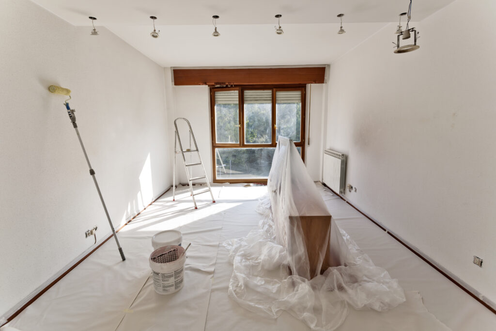
Choosing the right interior paint color sounds quite easy–look at your room, think about the color you’d like, and imagine how it would look on the walls. But once you start trying samples, factoring in lighting, and seeing the thousands of different shades, it can quickly become overwhelming. A color could look stunning in a showroom yet feel completely different in your home. That’s why homeowners across West Michigan turn to professionals like Van Tuinen Painting for guidance. Our thoughtful team of experts will help guide your decision, letting you confidently choose a color that matches your vision.
Color shapes how you feel in a room long before you consciously notice it. Soft neutrals can create a sense of calm, while bold tones energize a space and draw attention to details. It can be tempting to begin by picking your favorite color, but designers recommend you start by looking at the room as it is.
Natural light can be a heavy factor in what colors will feel right for a room. A room which gets warm, bright light throughout the day can enjoy rich, dark shades without feeling too heavy. Meanwhile, spaces with less daylight often benefit from warmer undertones that balance out the natural shade. The exact same color in these two rooms will feel dramatically different, just from the effects of natural light.
Artificial lighting can cause similar changes to a room’s mood. The bulbs you use–whether they are warm, cool, LED, or incandescent–can shift the way a color looks, especially at night. A paint that seemed perfectly balanced in the morning might look different in the evening. We recommend taking note of how your space looks at multiple times of day to avoid unfortunate surprises and make sure your space feels the way you want.
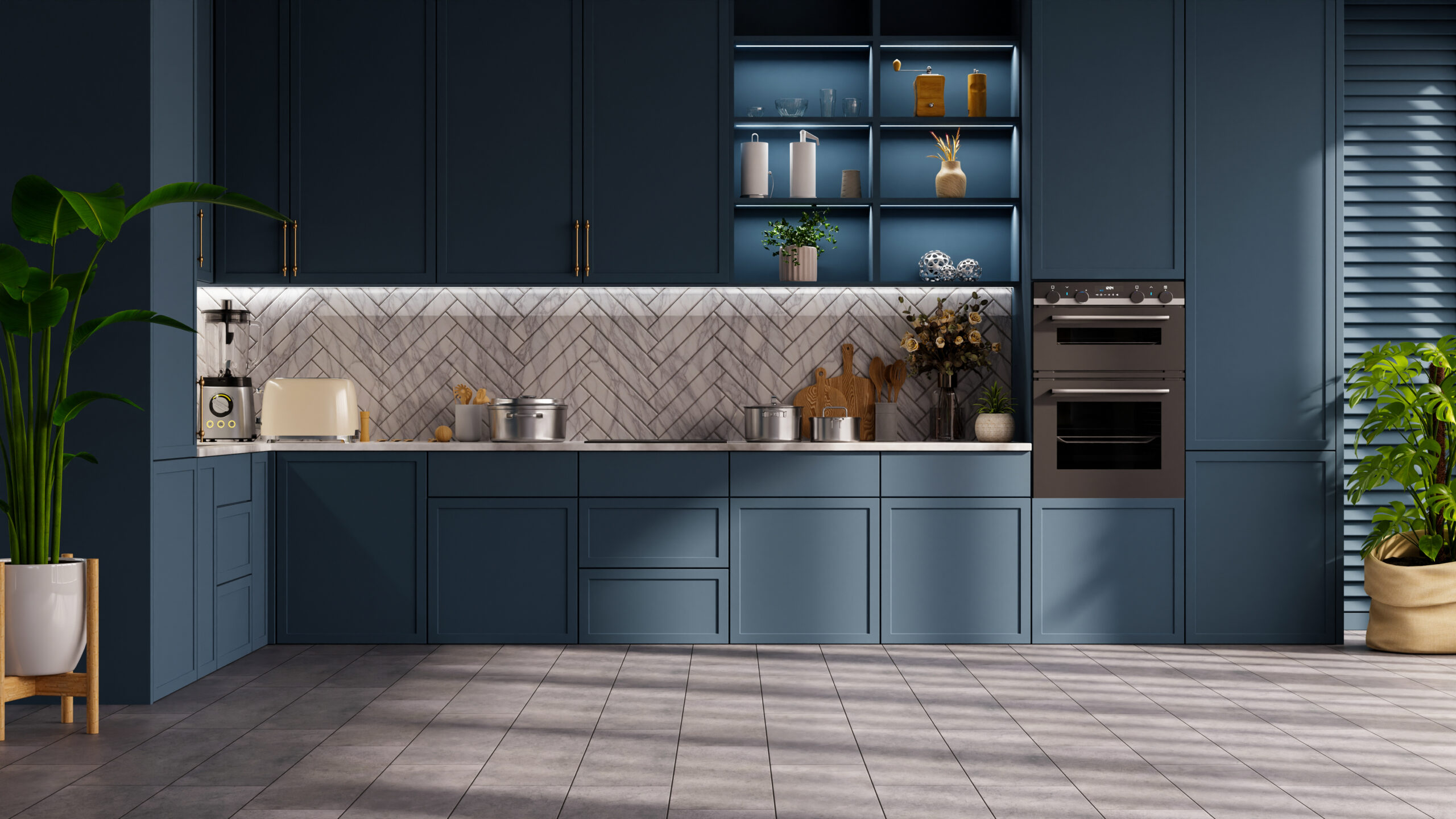
Another important consideration is the actual purpose of the room. A busy living room hosting family gatherings will benefit from inviting warm tones that encourage people to settle in. Bedrooms will benefit from cooler colors which encourage relaxation. Kitchens, home offices, dining rooms, entryways, and all sorts of other rooms all have their own purposes and cues. Matching the personality of the color to the purpose of your room makes your design feel intentional and thoughtful.
Existing elements should guide your choice more than some would expect. Flooring, cabinetry, countertops, trim, and furniture should all be considered, as they will carry various tones of their own. A beige carpet might lean slightly pink, yellow, or green. Wood trim can introduce both warmth or coolness depending on the stain. When the undertones in the room conflict with the undertones in the paint, it results in a weird “off” feeling. Checking your samples against these fixtures will go a long way towards preventing any strange contrasts.
Picking the right interior paint color doesn’t have to be an overwhelming experience. With thoughtful attention to light, function, tones, and finish, you can create a clean, comfortable space. Whether you’re refreshing a single room or planning a whole-house update, the right color brings personality to your space. Trust in Van Tuinen Painting’s expertise to help bring your vision to life in your next interior painting project.